I went to Canada's National Gallery today, usually a comfortable, ten minute stroll from our house, but with the snow underfoot and coming down in a biting -25º wind it was more like an arduous trudge. That's by the way. My intention was to visit the
M.C. Escher exhibition––very like the one I saw before at the same place 19 years ago!––but entrance to
the Jack Bush exhibition is included in the general entrance ticket, so I went there first and found it more interesting than I'd expected.
Friends of mine recommended I go to see the exhibition if only for the colours. It is good to feast the eyes on colour in the depths of an Ottawa winter.
 |
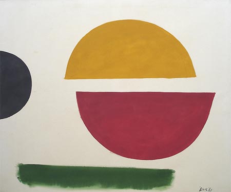
| Down and Across, 1967 |
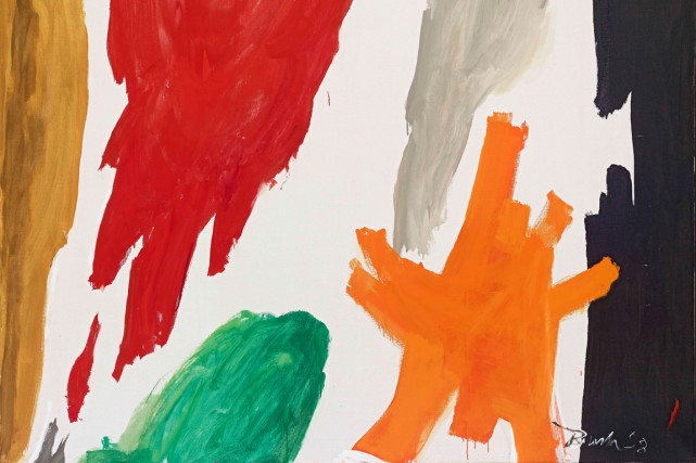
The (abstract) paintings he's known for feature large scale geometric shapes, stripes, columns, bands of colour, more often than not, which Bush created using rollers rather than brushes, sometimes circles or ovals or undefined daubs of colour. However, the paintings that stick in my mind now that I've left the exhibition are the ones that were slightly more representational.
Torn Raiment, that he'd painted during the Easter weekend of 1961, seems to refer to the crucifixion: a mostly black painting with an off-white vertical strip in the middle where the canvas was untouched and a purple shape central to the bottom half of the painting that could be seen as a violently torn cloth (Christ's robe?). According to the quotations from the diary he kept, Bush had started on this painting at breakfast time, "...worked and shaped and stared and changed, till by 3 I was covered with paint..." and was pleased with the result, calling it "raw––superb." Then in one of the galleries were paintings that his wife had kept aside for herself (this exhibition is the first that has shown them) in which he had spontaneously swept oils onto unprimed canvasses; they are a response to the sight of flowers in bloom. The one entitled
Bougainvillea is wonderful.
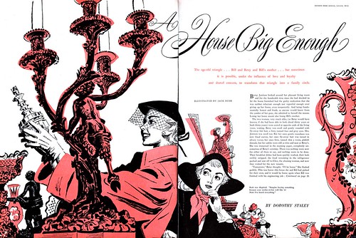 |
| Magazine illustration by Jack Bush |
 |
| Yesterday, 1947 |
Born in Montreal,
Jack Bush had moved to Toronto as a young artist and lived and worked there. His remunerative work was as an illustrator for magazines or advertising companies, drawing or painting in the popular style of the day. As a serious amateur artist, he started off as a
Group of Seven imitator and to judge by the room that showed his more conventional early paintings also seemed attracted to the
expressionists, or perhaps he was only trying out different styles. I thought those paintings good though, especially one called
The Lonely Road. In the late 40s it was clear that this man was seriously depressed (paintings of doors at strange angles and dark passages going nowhere, figures with head in hands or blank stares) and in fact his psychiatrist advised him to move on to abstracts to express his feelings in a different way.
His 1950s paintings were self-consciously trying to be abstracts, but he soon got the hang of it, and in the 1960s after seeing Chagall's
Firebird ballet sets and then returning from a first visit to Europe he realised he had to aim for "a sterner intensification in colour and simplicity," as the notes put it. There followed a series of about 35 "sash" paintings where the same shapes were repeated––like a dress with horizontal stripes and a wasp waist against a background of some primary colour.
"It seems I have three worlds," the artist said in the 50s, meaning his commercial work, the refuge of his home life and the experimental painting he did for his own satisfaction. "I find it difficult to relate these three worlds. Maybe though, like the areas in a painting, they are all complete entitites in themselves––but related by the space separating them." The importance of spaces in between!––that was an idea he put into the paintings themselves, such as
Culmination of 1955 (that has three areas of strong colour separated by empty canvas) and
Split Circle of 1961.
Here's another,
Down Sweep (1958):


No comments:
Post a Comment